
Lines graphically illustrate linear functions, which are stated in slope-intercept form as:
y=mx+b
To calculate the line and slope for our data in excel we need to first make a plot.
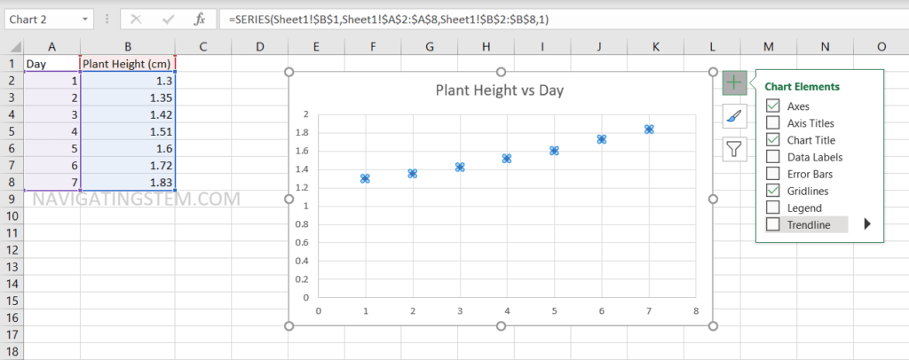
We are going to use example data that is plant height in centimeters for each day in a week.
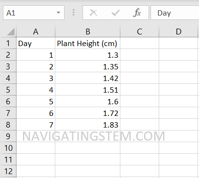
We have our data entered into excel in columns. In Column A we have “Days” which will be our x-axis in the plot. In Column B we have “Plant Height (cm)”, this will be our y-axis in the plot.
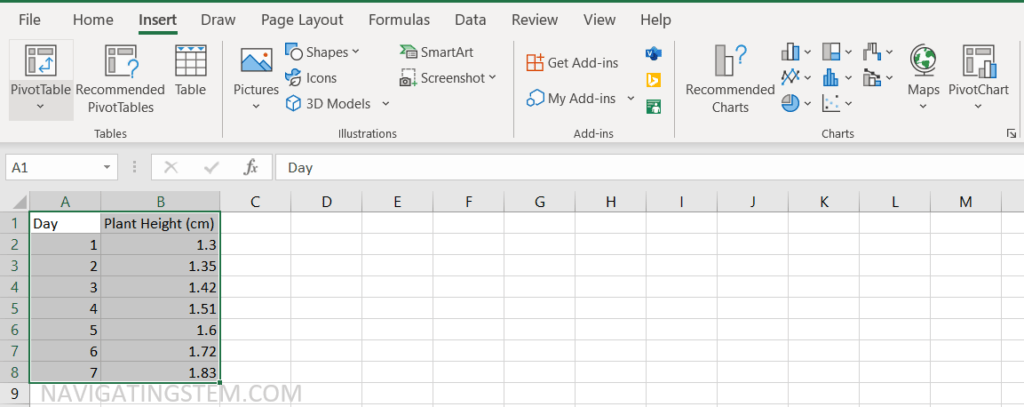
To create a plot, we first need to select the data to be in the plot.
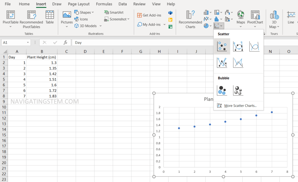
To create the plot, we need to navigate to “Insert” shown at the top. In this menu, there will be multiple chart types you can choose from. We will be using a Scatter plot for this tutorial (shown highlighted in the above image).
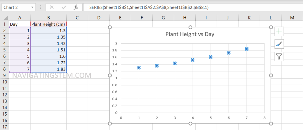
After selecting the Scatter plot, we will see our data plotted in a graph. You can change the title by selecting the text and typing an appropriate title.
Next, we will add a trendline for our data. You will click on one of the data points and three options will appear to the right. The trendline option will appear when the “+” image is selected. Check the “Trendline” option to add a trendline that fits the data plotted.
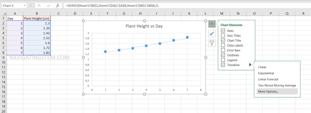
After plotting the trendline, we would like to determine the line equation and R-squared. By clicking the black triangle, you will be given a drop down menu. Clicking “more options” will bring up a menu to the right of the screen.
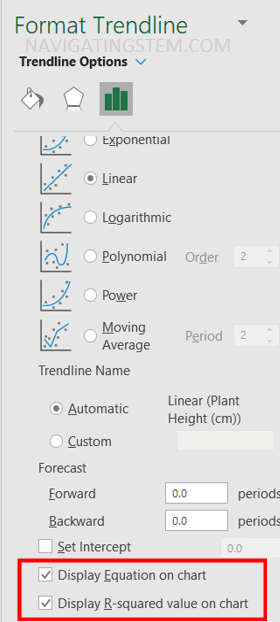
This menu will appear after selecting “More options.” To show the equation and R-squared value, check the two boxes for “Display Equation on chart” and “Display R-squared value on chart.”
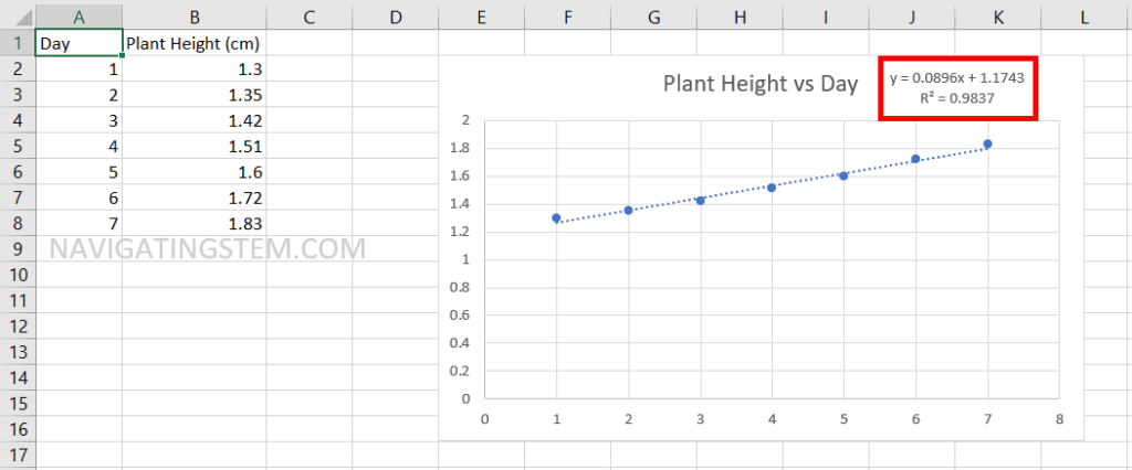
Now the equation will be shown on your chart in the form of y=mx+b. In this case, our slope is 0.0896 and our R-squared value is 0.9837.